Higher One
Background
Project Brief
Higher One is a payment platform built for universities. These universities use the product to handle everything from selling mugs and sweatshirts, to managing payment for an entire year's tuition. Their platform was built in the 90s and hadn't gotten much love since (see below), so they were very eager for a more modern checkout experience.
Central to the redesign were 3 things:
1) The site had to be responsive. Their current site didn't translate well to mobile, and their competitors offered better mobile checkout solutions.
2) The site has to be WCAG 2.0 compliant at least to the AA level. Since many of Higher One's customers were universities that received federal funding, accessibility was mandatory.
3) It was also critical that universities be able to customize their "storefronts." Many of Higher One's clients hosted their store on their own sites, but then pushed users to Higher One's platform just for the financial transaction. In order to keep this transition from being jarring for the user, it was important that the checkout flow pick up on the university colors used in the web store. We also had to ensure that this customization didn't compromise the accessibility (specifically contrast ratios) of the site.
My Role
As the lead UX designer on this project I managed the relationship with the client, meeting with their developers, designers and Product Managers, I learned and documented all the requirements for the new product, lead early brainstorming sessions and created the first sketches and wireframes. As we received feedback from the client and moved towards higher fidelity, I created many of the mockups, but also managed a UI designer who aided in pushing the designs towards pixel perfection. Once we got sign off on the desktop and mobile prototypes we built, I then drafted the elaborate page flow and documentation for the engineers.
Learning about the product
The Higher One product was a very complex one to redesign without any prior understanding of the system. Over it's nearly 20 years of existence, the product had evolved slowly with features and capabilities layered on top of each other creating a tangled web of interdependencies and exceptions. There were come older customers with some legacy features that had since been deprecated for most customers. There were unique situations where students needed to be logged in to use the site and other situations where guest users, like a student's parent, needed to be able to make payments on someone else's behalf.
All this is to say that there was a lot to learn before we could even think about redesigning the checkout flow. In order to do this, I ensured that our team was imbedded in the Higher One office for the first two weeks. We ended up spending most of our time working from the Higher One offices so we could quickly ask questions when we ran into ambiguity, but the first two weeks were especially important.
Learning about compliance
As mentioned above, many of the universities that Higher One worked with received federal funding so they needed to be fully accessible for users with disabilities. This meant meeting at least the WCAG 2.0 AA compliance level. I spent a lot of time in the first couple weeks familiarizing myself with all the rules of building an accessible site. Many of the considerations were to be implemented by the developers, but there were visual implications as well, such as guaranteed contrast ratios, text size minimums, headings, labels and indication of place in flow, to name a few.
In early conversations with our developers about compliance, we decided to use the Bootstrap 4 framework because many of the accessibility necessities come out of the box.
DESIGN
Competitive Analysis
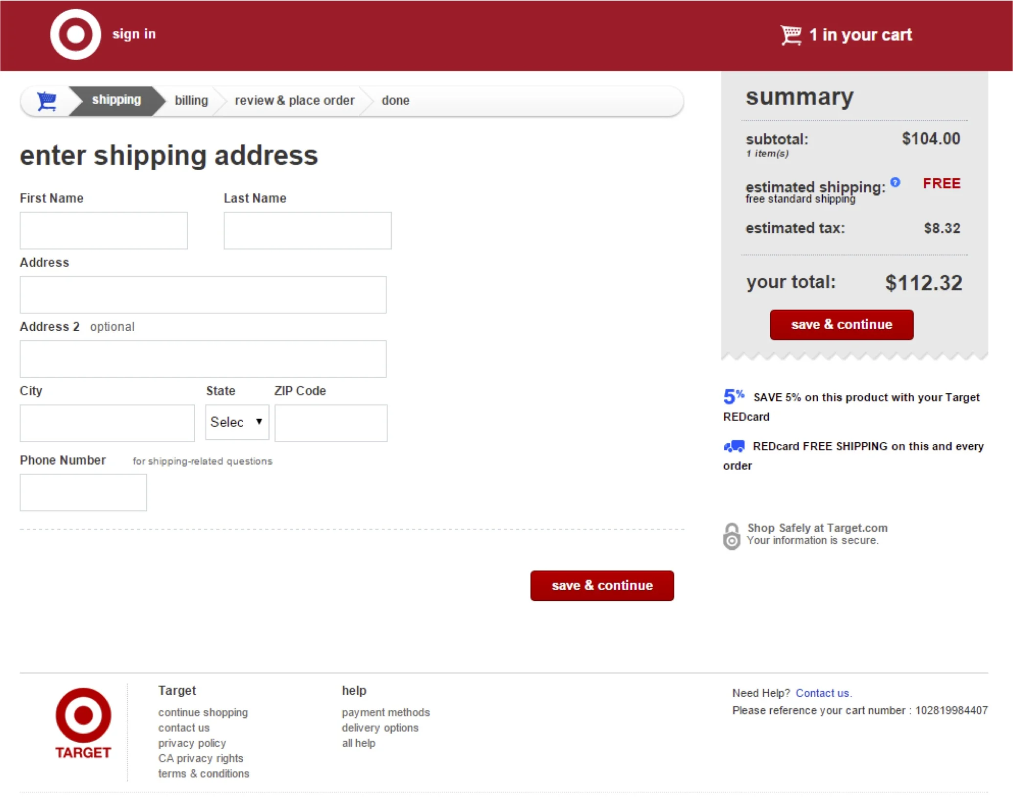
Before we started to design we looked at many existing checkout flows. Excerpts of three of them are shown below.
From these explorations we found three things that we wanted to incorporate into our design.
1) Summary of cart on the right side. We wanted the user to always be able to see what they were purchasing.
2) Progress indicator. The current checkout flow didn't give the user any indication of how far along the process they were, and we knew that had to change.
3) Only display on screen what is pertinent to the current step. Keep all other steps within a single click so users can edit if needed, but simplify what is displayed on screen to keep the user focused on the current step.
Early Sketches
Unfortunately, the early sketched I did have been lost. :(
Just know that I started with pencil and paper. I love pencil and paper. Clients love pencil and paper. Pencil and paper are great.
Iterating on designs
As mentioned before, we spent most of our time imbedded with Higher One. One of the reasons was that we had regular presentations with stakeholders to ensure we were moving in the right direction and that our design solutions would work with their technological constraints.
We did 3 official reviews with all stakeholders, and daily check ins with design and engineer counterparts.
Color customization (and simplification)
Because universities wanted their stores to match their university colors, it was important for them to be able to customize the colors used in their store. Higher One's existing solution to this was to let the admin customize just about everything on the page. While this gave the admin great control, it also came with some problems. It expected a lot from the user, it made it really easy to make an unbelievably ugly site, and it also increased the likelihood that the admin could arrive at a combination of colors that would break some accessibility rules.
Here is the admin color control panel before redesign.
In order to simplify this we did a few things
1) Lock down certain colors. Things like "Error Text" we didn't allow the user to change any more. This came with pushback from certain stakeholders, but when asked exactly why they resisted the change it became clear that it was because they thought it was going to be hard to tell users that they now had less functionality. We dug into the number of users that had actually changed the color from the default, and it was a very small percentage, so stakeholders agreed that it was a good idea.
2) Divide into "Main" color controls, and an "Advanced" color control panel. This way the experience was simple for most users, but if someone wanted to access more options, they could.
3) Get creative with overlays. In order to give the appearance of more color diversity on screen, we used overlays. When a user selected the "Primary" color for their story, there were also areas on the page that would get that primary color plus a 15% opacity white overlay.
Below is the simplified color control panel and notations to show what option controls which element on screen.
HANDOFF
Page flow for handoff to engineering
This was not a straight forward checkout flow. There were different pages needed depending on the type of product being purchased (tuition doesn't need shipping address for instance), and different information needed on screen depending on the payment method (instructions and terms if paying with ACH for instance. There were also differences based on the log in state of the user, settings in the individual customer's control panel, and different taxes and fees added based on shipping address, to name a few.
In order to transfer to the developers all the knowledge I had built of the system, I drew up a detailed page flow diagram, and robust documentation for each page. For privacy reason, I won't share that 10 page document here, but below you can see the page flow diagram.
Page flow diagram
Prototype
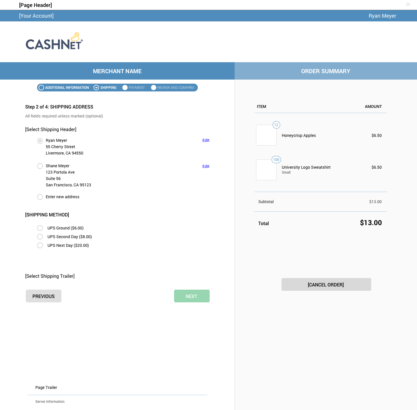
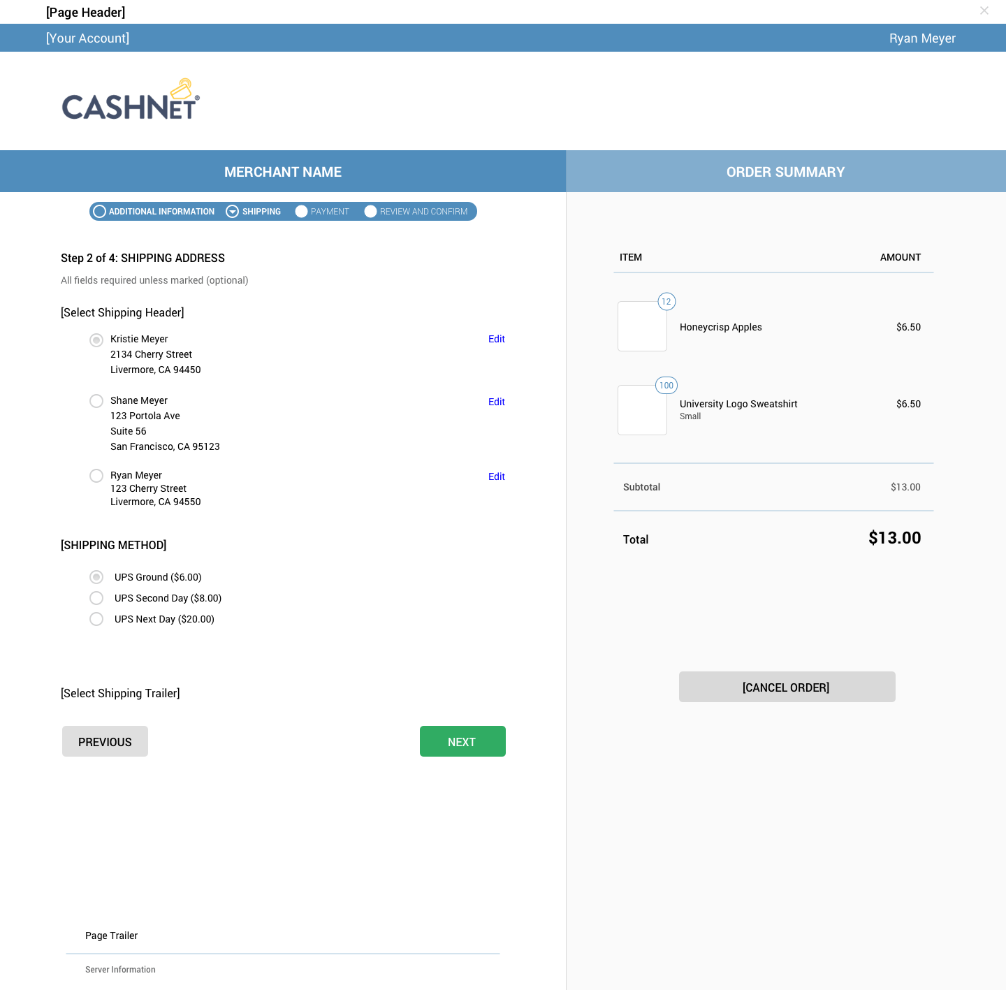
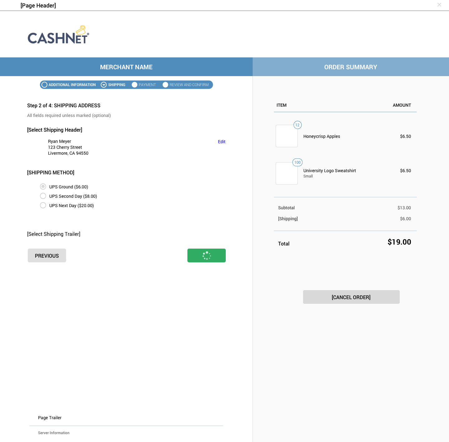
In order to let our stakeholders, and engineers, see exactly how we wanted it to work, we put together a prototype in Invision. Again, to protect the privacy of the product I can't share the whole prototype, but I have included the "Shipping Info" steps in galleries below, one for desktop and one for mobile.
Desktop


Mobile


